Why leave part of a cabochon matte?
The center of this black jade cabochon is deliberately matte. Beside its polished upper and lower sections, that quieter surface becomes the detail that holds the design together.
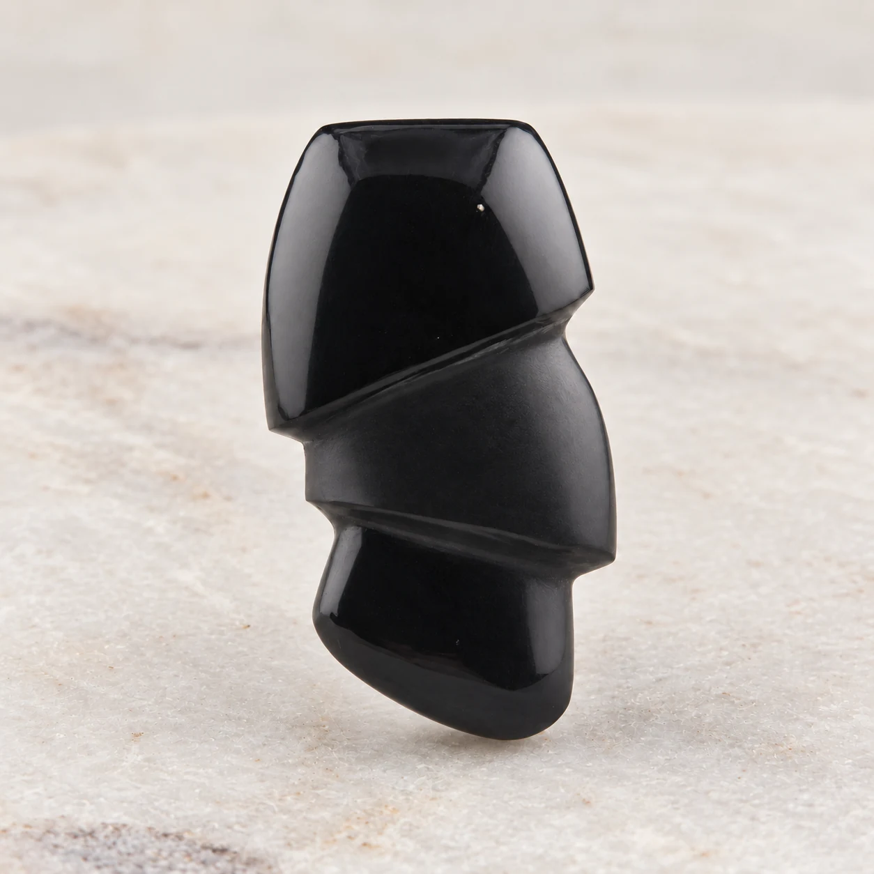
Three sections, one piece of stone
Start with the two curved grooves. They cross the face on a slant, dividing the dark stone into three unequal areas. The upper section is broad, the center tapers across the face, and the lower section rounds into the base. The grooves give the eye a path to follow even though the color stays almost entirely black.
Now look at the light. In the photograph, the polished upper section carries a clear, bright reflection. The lower section catches a smaller highlight along its curve. Between them, the center shows a fine, subdued texture. It does not need another color to stand apart. The difference in finish is enough.
That center was left matte on purpose. A description that calls the whole cabochon highly polished would miss an important part of the piece. For this design, the surface treatment deserves as much attention as the outline.
Giving a dark pendant somewhere to rest
Imagine the same shape with three equally glossy sections. Each area could compete for a reflection. Here, the matte center creates a pause between the brighter surfaces. The curved divisions remain easy to read, while the finish gives each section its own role.
This is useful when choosing a pendant that has a restrained palette. A single dark color can still contain a lot to look at: a change of plane, a shallow groove, a rounded edge, or a surface that holds the light differently. At necklace distance, the outline makes the first impression. Closer up, those smaller decisions become visible.
There is no requirement for every part of an artisan cabochon to have the same finish. What matters is whether the difference is intentional and clearly described. In this piece, the matte area is central to the composition; it is not a section awaiting a final polish.
What a photograph can tell you
A bright rectangle on a dark polished stone can be a reflection of the light used to photograph it. In our image, the pale highlight on the upper section should not be read as a white patch in the material. Look across the full set of listing photographs before deciding how the stone is patterned.
For a piece with mixed finishes, compare the center and the outer sections within the same photograph. Then check the close-up for the texture and the ruler photograph for size. These views answer different questions: how the piece is composed, what its surface looks like, and how large it will be.
If a detail is still unclear, ask about that detail specifically. “Is the center intentionally matte?” gives the maker a much more useful starting point than “Is it shiny?” A short question about the surface can prevent a mismatch between the photograph and your expectations.
Making the stone the focus
For this kind of sculpted cabochon, a simple chain lets the curved sections remain prominent. Silver creates a cooler contrast with the black; a gold-colored finish adds warmth. Consider the jewelry the recipient already wears, especially if this will be a gift worn beside familiar pieces.
Our pendant finish uses an epoxy-attached bail at the back, keeping the stone’s outline visible. You can choose the cabochon on its own, add a bail for a chain you already have, or add both a bail and a chain. The finish options let you decide how the piece will be worn without changing the surface that gives it its character.
If you like the idea of contrasting textures for a custom design, describe that preference in your notes or contact the studio. A request begins a conversation about what suits the chosen material and shape; it does not assume this exact carved design can be repeated.