Polychrome jasper and the art of leaving room
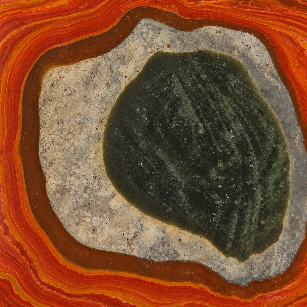
The face of polychrome jasper can read like a small painting, and a good small painting does not ask every square inch to shout. In our representative image, hot orange bands circle a pale gray field while one deep green shape carries most of the visual weight. The quiet parts are doing real work.
Give the colors three different jobs
Begin with the largest color area. That is the part your eye is likely to read first from ordinary conversation distance. In this image, the dark green center acts as the dominant field. The bright orange around the outside is smaller in area but louder in color, so it works as an accent. Between them, pale gray creates breathing room.
Those jobs matter more than counting every shade. A stone may contain rust, cream, ochre, gray, green, and a few colors that refuse to fill out the paperwork. If all of them receive equal attention, choosing a composition becomes unnecessarily difficult. Ask instead which field should lead, which should spark, and which should let the other two be seen.
Breathing room does not have to be white or blank. Here it is speckled gray with visible variation. It feels quiet only in relation to the saturated orange and dense green beside it. That contrast is what keeps the bright border from swallowing the whole picture.
Try the thumbnail test
Look at the material image at thumbnail size, or step back until the fine details soften. Which two or three color masses remain? That is close to how a pendant first reads before someone leans in. The test is useful because polychrome jasper can be fascinating at full-screen size and surprisingly different when reduced to something worn on a chain.
For this image, the thumbnail still holds three clear parts: a dark center, a pale ring, and a hot outer band. The tiny speckles and narrow stripes add interest up close, but they do not control the first impression. If one of those small details is the only part you love, it may be too delicate a priority for a custom cut based on naturally variable material.
Try naming the result in one short phrase: “mostly dark with a bright edge,” “warm color with a quiet middle,” or “an even balance of light and dark.” These are descriptions of a preference, not promises about an exact future stone. They give the designer room to work while still saying what you actually want.
Choose a color ratio before an outline
Next, decide how much calm and color you want. A mostly quiet composition might use one broad neutral field with a smaller rust or orange accent. A balanced composition could give warm and cool areas similar visual weight. A color-forward composition might let orange or ochre occupy most of the face, with gray appearing only as a pause.
This ratio changes the mood even when the palette stays the same. One red chair in a calm room feels deliberate. Twelve red chairs have formed a committee. The issue is not whether a color is bold; it is how much space that color receives and what surrounds it.
Once the ratio is clear, a simple outline can help preserve it. An oval, cushion, or restrained freeform shape gives the color fields a clean boundary instead of adding another competing idea. A more elaborate outline can still work, but it asks the edge and the interior to share attention. If the dark center or orange border is already the reason you chose the material, the shape does not need a separate speech.
Use the image as a vocabulary, not a guarantee
The approved image shows the kind of broad color relationships polychrome jasper can offer. It is a representative material image, not a photograph of the exact stone reserved for a custom order. Natural pattern and color placement vary, so an individual piece may not contain this particular green center, pale ring, or orange border.
That makes broad preferences more useful than requests for a duplicate. “I like a dark dominant field with a warm accent” describes a relationship that can guide a real choice. “Please make the exact island in this photograph” asks natural material to work from a photocopier.
The shapes may suggest a pond, a hill, an eye, or nothing more complicated than color beside color. Those are personal readings. You do not need to settle the geography to choose well. Decide which color should lead, how much breathing room you enjoy, and whether the composition still works when it is small. The rest can remain pleasantly open.